Have you ever been given a design brief with a single end goal to raise the conversion rate?
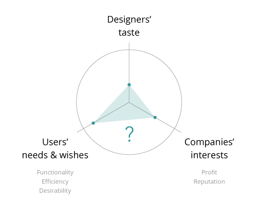
As UX/UI designers, we were trained to think from end-users’ perspectives. We’re no stranger to the process of selecting target users, observing them, talking with them and even creating with them in order to elicit insights that can potentially improve the products or services. In other words, we design with users’ needs and wishes in mind. Our success is plausibly equivalent to users’ satisfaction.
However, in the real world, products and services usually belong to companies, and companies usually exist for profit making. Making money and meeting people’s desires are two very different goals that don’t always harmonize. As such, how to reach a compromise from both ends becomes an issue under heated debate.
I came across the term — UX dark patterns — when I was investigating ethical issues in the UX research domain. Basically, dark patterns mean the well-crafted designs that intentionally trick users into performing a certain action against their wills. For example, the hidden cost popping up only at the very last page of the shopping flow without proper explanations; The super easy opt-in services (e.g. sign up for the membership) versus the lengthy and difficult opt-out options (e.g. cancel the membership); The ads seamlessly incorporated in the article feed without sharp distinctions. More examples can be found in darkpatterns.org.
Almost all designs with UX dark patterns can boil down to one single attempt — to increase companies’ revenue. This phenomenon is ubiquitous especially in the digital era. Recently, Linkedin’s friend spam of “expanding your network” hitting the headline due to a class-action lawsuit was a striking example. The fact that online payment gets more effortless and personal data becomes more accessible gives dark patterns sufficient room to grow.
Some, including myself when I was first introduced to the concept, might hold a view that the UX dark patterns are out of question — bad designs, because it attempts to deceive or manipulate users in favor of companies’ interest. It’s not honest, and therefore can not be justified ethically in most cases.
However, after looking into more cases, I’d rather believe that UX dark patterns are not necessarily bad designs, but compromised designs.
In reality, there are very few products or services that can completely differentiate themselves from other competitors’. Especially in the highly mature markets, such as insurance or online hotel booking, companies are struggling to stand out, even to survive. Consequently, UX dark patterns find its way in this situation to provide companies a temporary but effective placebo to have a stand in the market. Had they had other better options to retain customers and keep financial growth, they would not need to risk pissing their customers off by engaging in the dirty tricks.
In addition, some companies who excessively applied dark patterns in their design are not because they are greedy monsters, but because dark patterns are part of their business model. That is to say, they need the UX dark patterns to keep the business running. Take budget airlines for example, in order to provide users with flight tickets with insanely low fares, they have to rely on add-on costs to offset the loss from the ticket price. Some innocent users end up falling into the “trap” and paying more, while the careful others get the chance to enjoy the affordable travel. In this case, it is arguable that the dark patterns are just the means for these companies to reach the ends — to offer valuable services to users.
Designs are all about trade-offs. There is no such thing as a perfect design. It’s essential for designers to understand this inherent flaw in order to find that magical balance between different perspectives from different stakeholders.
With that said, I think for designers, if we have ever been involved in dark pattern designs, we don’t have to blame on ourself unforgivingly. Neither must we fight against it relentlessly. Instead, we can dig into the following questions:
-
How to design a top-notch UX so that dark patterns are not necessary for retaining customers? (Some inspirations: Slack, Mint, Airbnb)
-
How to establish a system/legislation that clearly defines the ethical boundary in the digital world? Which UX dark pattern is too dark? (Some inspirations: UXPA Code of Professional Conduct, ACM Code of Ethics, DIA code of Ethics, Marketing Ethics, AMA Statement of Ethics, Ethical Principles of Psychologists And Code of Conduct)
-
How to use techniques of UX dark patterns, aka persuasive design or behavioral design, to drive positive/meaningful change? (Some inspirations: Facebook added the organ donor status to get more people register as a donor.)
To be fair, increasing the conversion rate is not an evil goal from the business point of view. It’s just a practical goal. As long as the profit-driven nature of companies doesn’t change, it will always be a challenge for designers to bridge the gap between ideal user solutions and ideal product solutions.
(This article was also published on Medium)


