Overview
This was my individual graduation project for Master of Design for Interaction at Delft University of Technology.
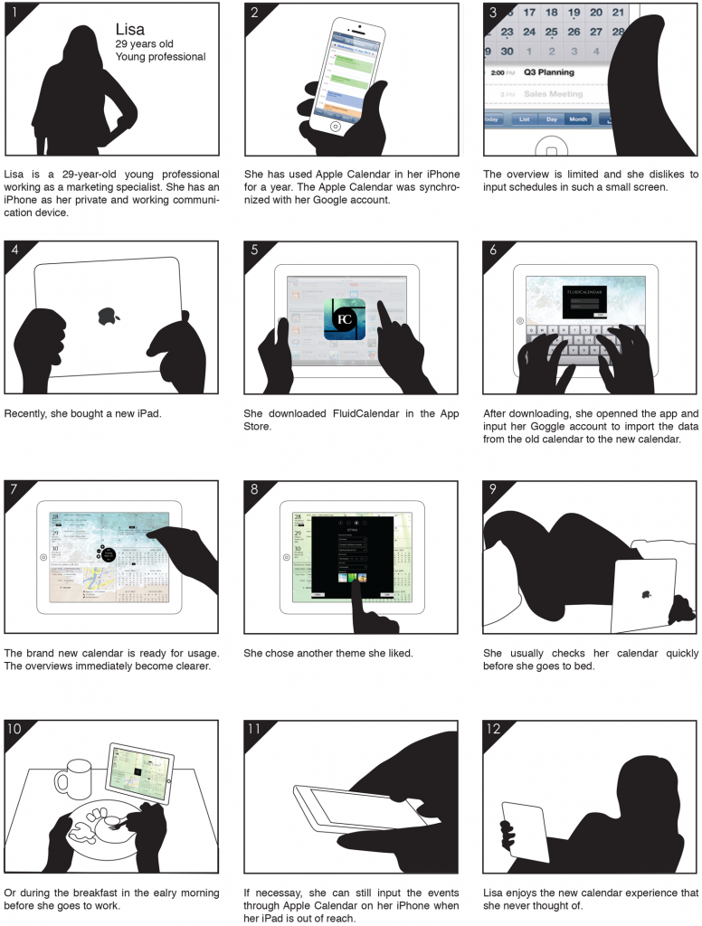
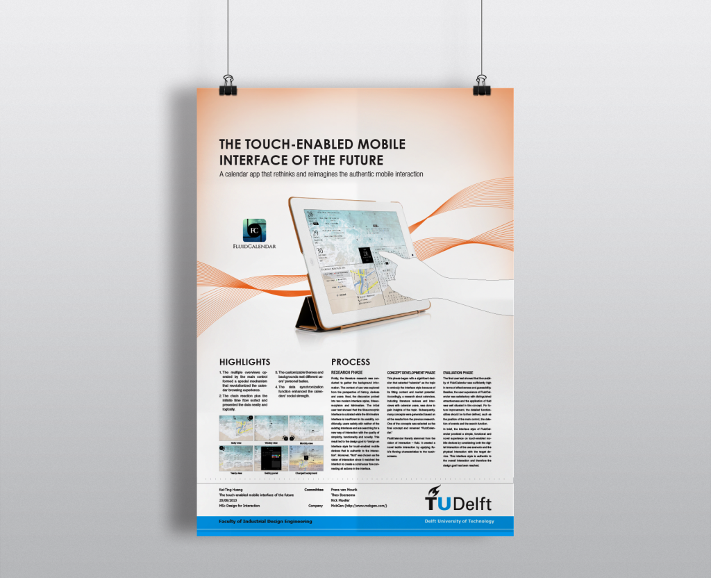
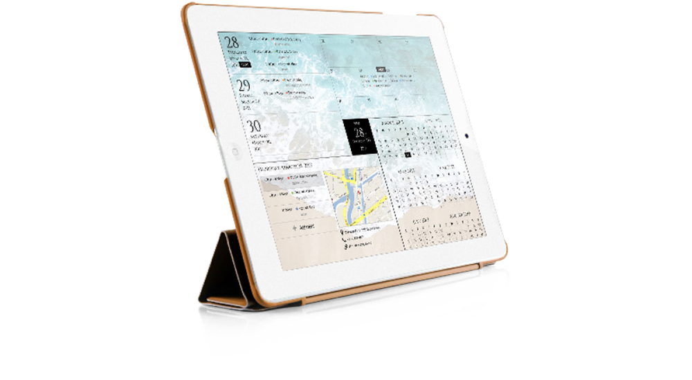
In close cooperation with MobGen, a full-service mobile agency located in Amsterdam, this project aimed for developing an interface for touch-enabled mobile devices of the near future. The final outcome was a calendar app, called FluidCalendar, that rethinks and reimagines the authentic mobile interaction.
Time
02/2013 – 07/2013
Role
Sole designer and researcher
Research phase
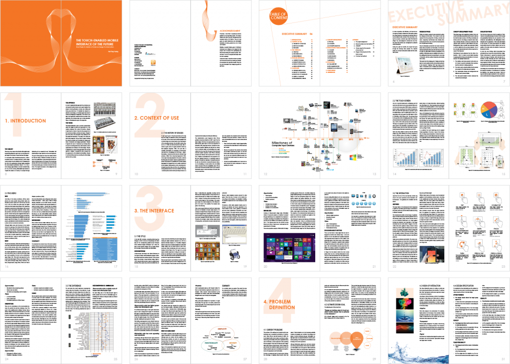
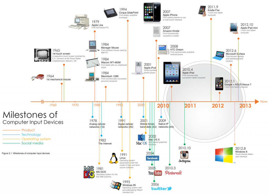
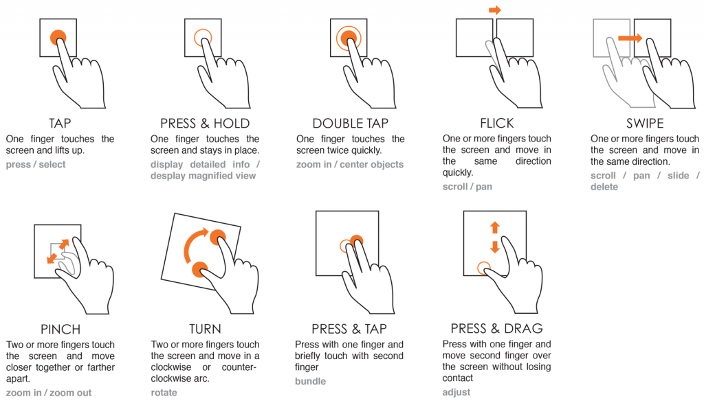
Firstly, the literature research was conducted to gather the background information. The context of use was explored from the perspective of history, devices and users. Apparently, touchscreens have already influenced people’s life in and out and the market penetration will just keep increasing.
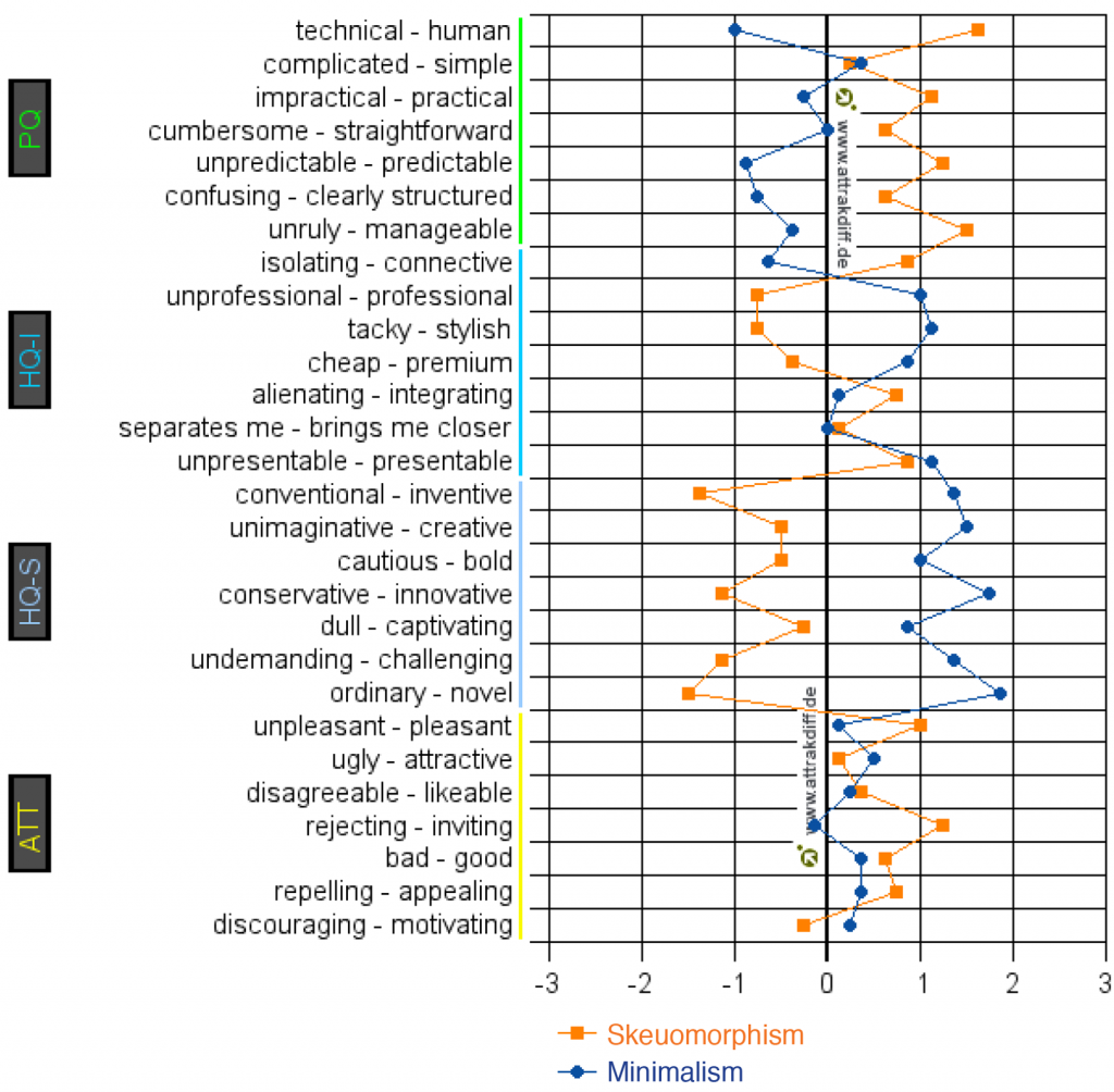
Next, the discussion probed into two modern interface styles, Skeuomorphism and Minimalism. An initial user test showed that the Skeuomorphic interface is outdated while the Minimalism interface is insufficient in its usability. Additionally, users are satisfied with neither of the existing interfaces and are searching for a new way of interaction with the quality of simplicity, functionality and novelty.
This result led to the design goal to “design an interface style for touch-enabled mobile devices that is authentic to the interaction”. Besides, “fluid” was chosen as the vision of interaction since it matched the intention to create a continuous flow connecting all actions in the interface.
Concept development phase
This phase began with a significant decision that a calendar functionality was selected as the topic to embody the interface style because of its fitting complexity and market potential. Accordingly, research about calendars, including literature reviews and interviews with calendar users, was done to gain insights into the topic. Subsequently, many concepts were generated based on all the results from the previous research. One of the concepts was selected as the final concept and renamed “FluidCalendar.”
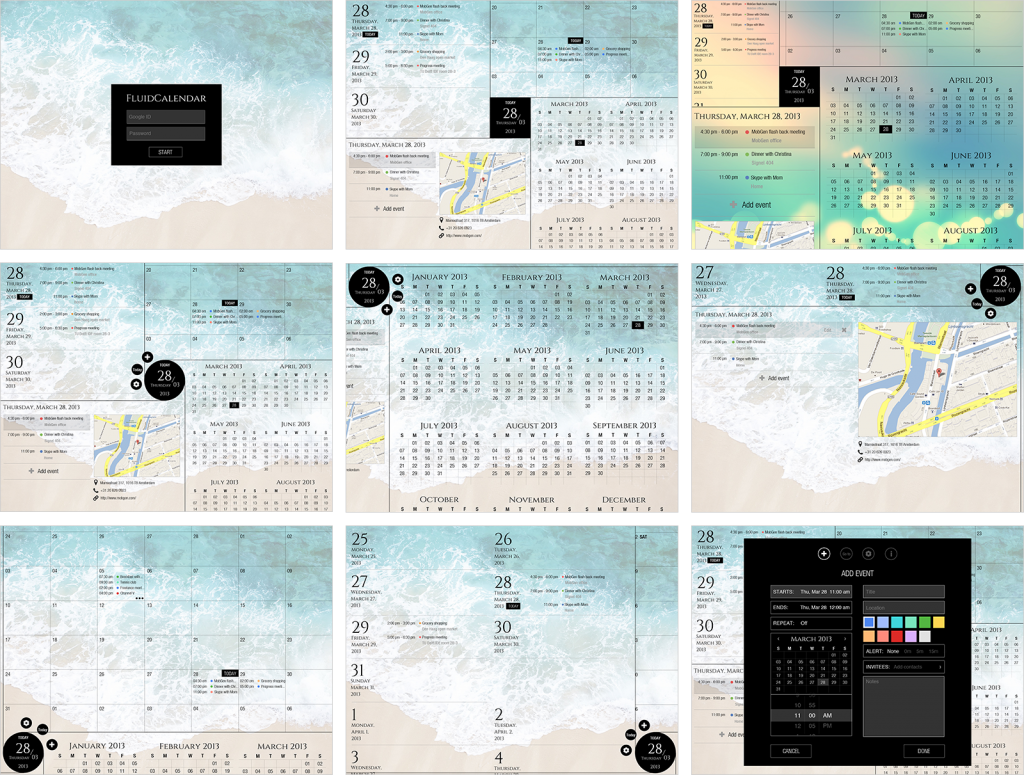
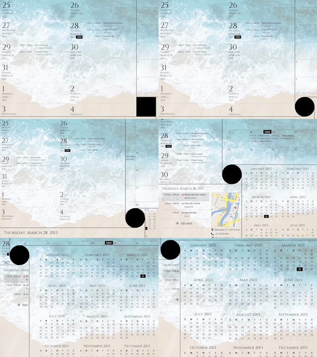
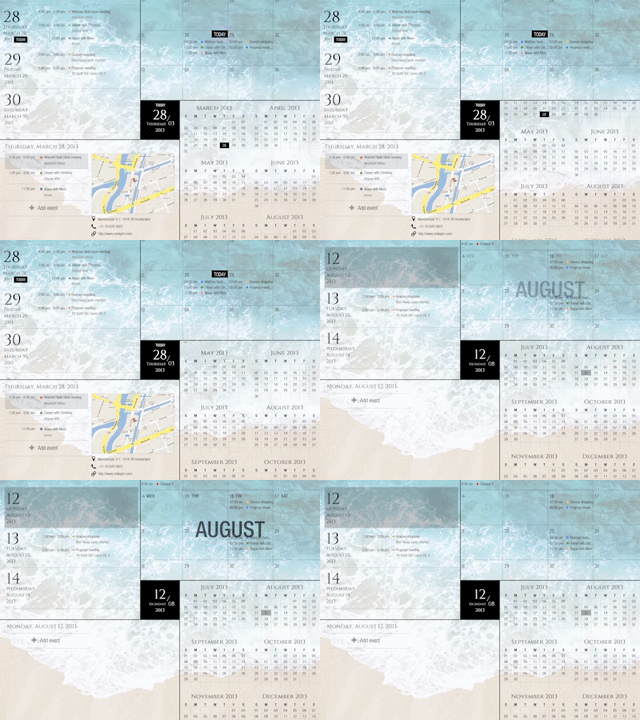
FluidCalendar literally stemmed from the vision of interaction – fluid. It created a novel tactile interaction by applying fluid’s flowing characteristics to the touchscreens. The highlight features are:
- The multiple overviews operated by the main control formed a special mechanism that revolutionized the calendar browsing experience.
- The chain reaction plus the infinite time sorted and presented the data neatly and logically.
- The customizable themes and backgrounds met different users’ personal tastes.
- The data synchronization function enhanced the calendar’s social strength.
Evaluation phase
The final user test showed that the usability of FluidCalendar was sufficiently high in terms of effectiveness and guessability. Besides, the user experience of FluidCalendar was satisfactory with distinguished attractiveness and the application of fluid was well situated in this concept. For future improvement, the detailed functionalities should be further defined, such as the position of the main control, the deletion of events and the search function.
In brief, the new interface style incorporates three principles that go beyond the current interface design. Firstly, it allows user to operate the elements directly without the usage of handles, which shortens the interaction process. Secondly, the main control serves as the only starting point of different routes leading to deeper layers of content. Thirdly, users can have multiple focuses at the same time and the screen real estate of each focus can be freely customized.
Accordingly, the new interface style took advantage of the physical interaction of touchscreens to maximize the usability in the calendar use scenario. That is to say, the interface style is authentic to the overall interaction and therefore the design goal has been reached.
