Google People Primitives

Surface people-related information across Google’s apps

Overview

People Primitives are a set of universal components that help surface people-related information across Google’s apps, such as Gmail, Calendar, Chat, and Docs/Slides/Sheets, etc.

I was the lead designer for multiple components, including People Card, People Sheet and People Companion.

Time

2018 – 2020

Role

Lead designer

User problem

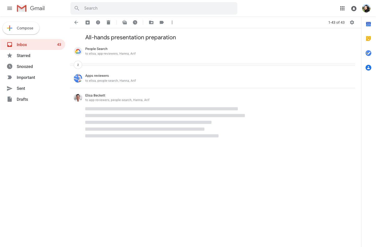
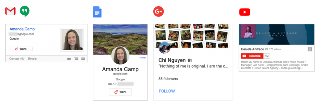
Many Google products need to surface people-related information for users to better connect with each other, especially for enterprise users. However, as of 2018, the people-related widgets across products were inconsistent and outdated. This resulted in unhelpful UIs and broken journeys.

Inconsistent People information across Google
Information is not very useful
Same problem on mobile
Early research findings

To examine the severity of the problem, I partnered with the research team to conduct foundational research, looking into enterprise users’ sentiment on the existing products as well as their unspoken needs. We discovered that: 

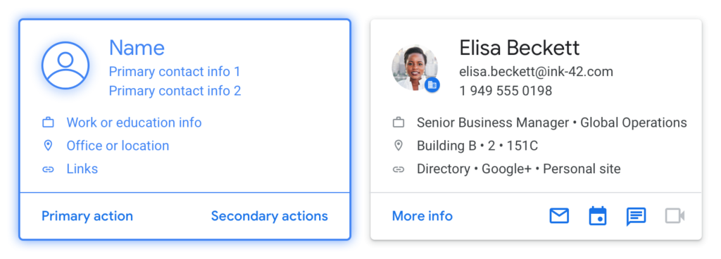
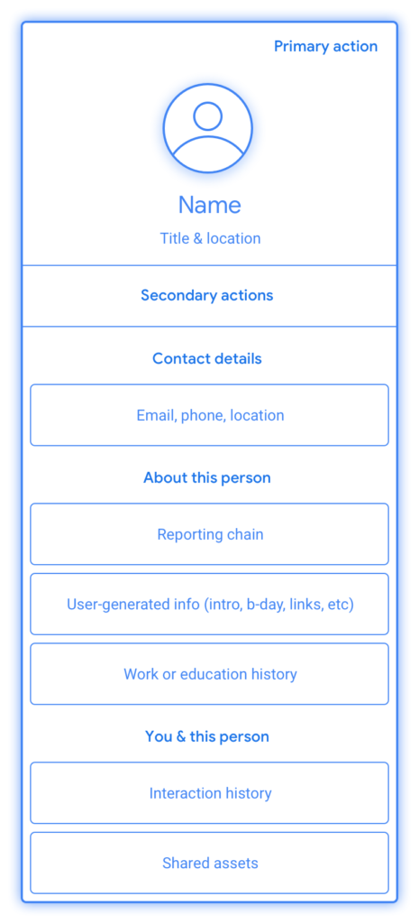
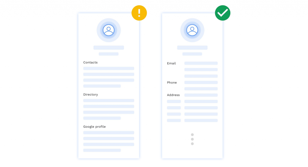
1. Users want all information in one place:

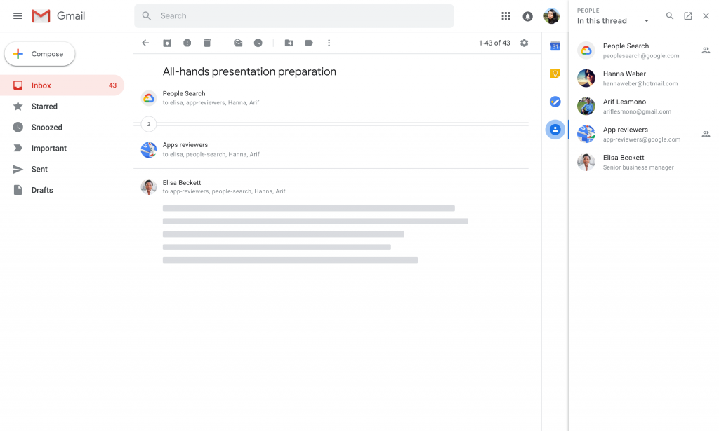
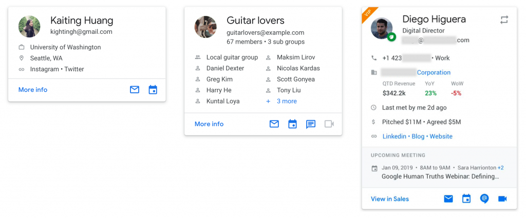
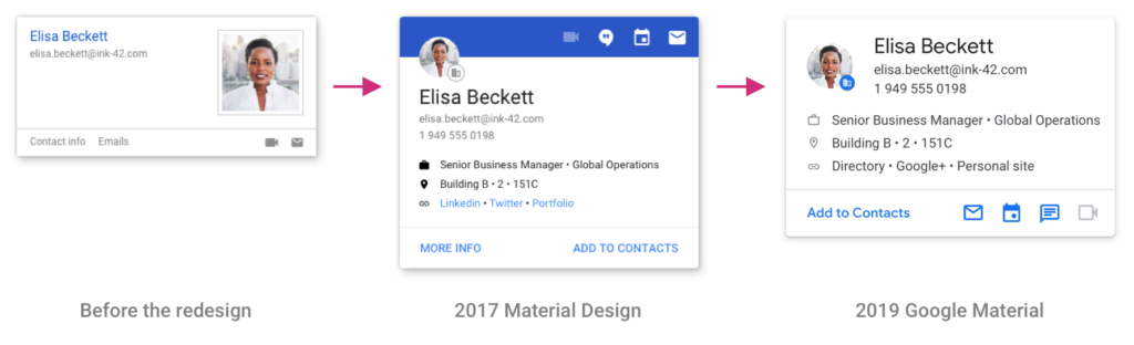
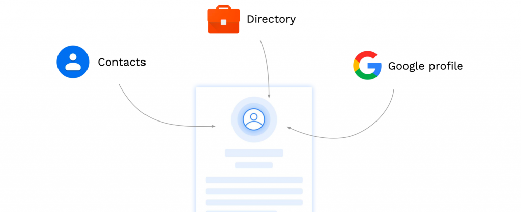
Google’s people-related data scatter across Directory, Google Contacts, and users’ Google profile. When it comes to learning about a person, users want an aggregated presentation that includes everything Google knows about this person.

Users don’t want independent apps
Users want to group information by types not by sources
2. Users desire a continuous workflow:

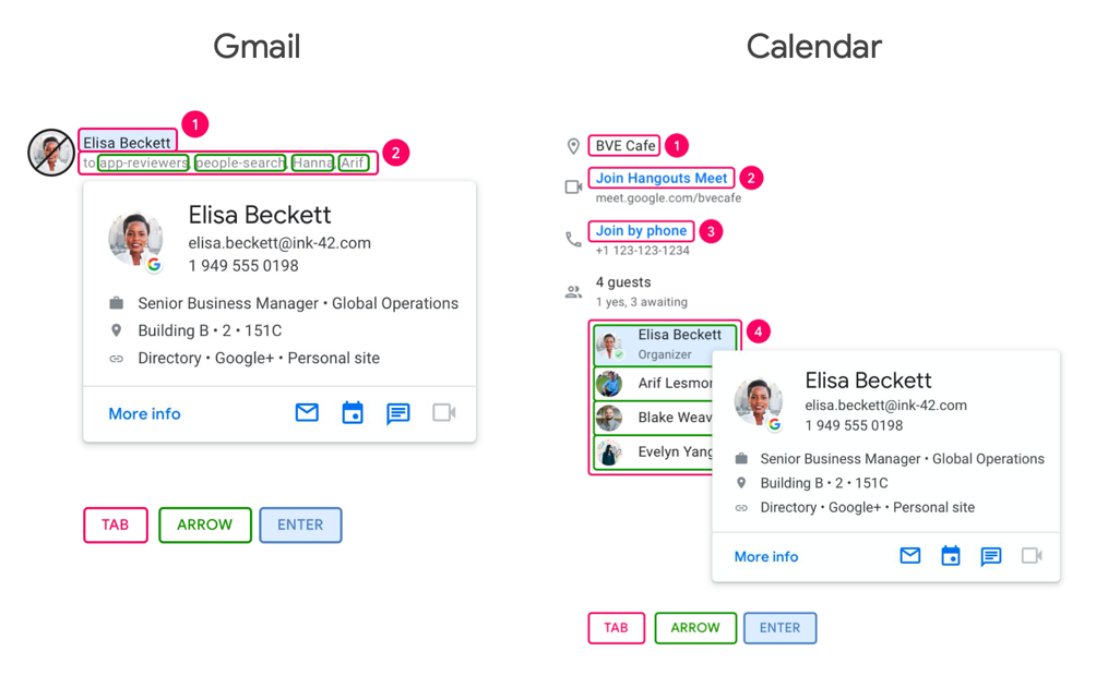
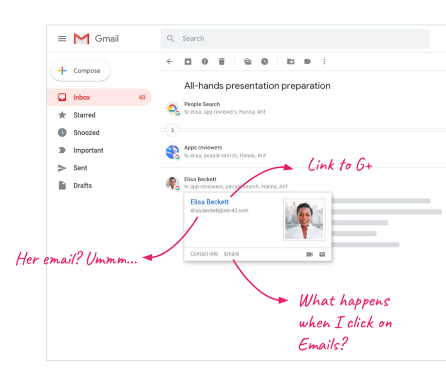
Enterprise users typically rely on separate HR tools to find out more information about their coworkers, such as the job title and reporting chain. This requires them to open another tab or window, which disrupts their workflow. It would be more helpful if the info can appear directly in the context of their task.

3. Users have a similar hierarchy of info needs:

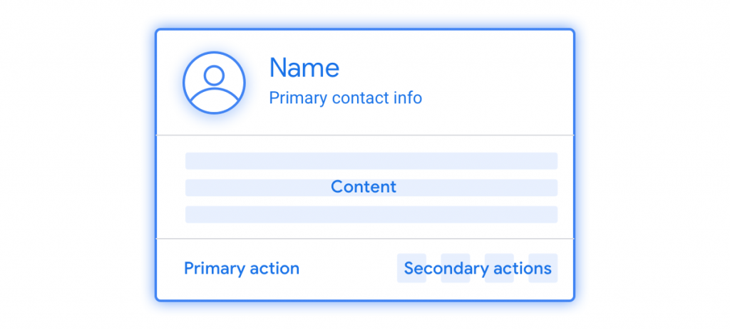
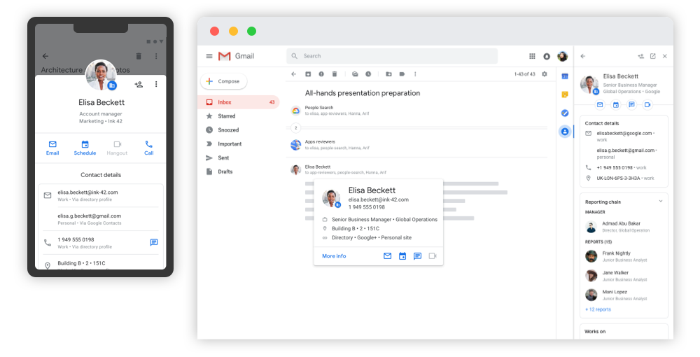
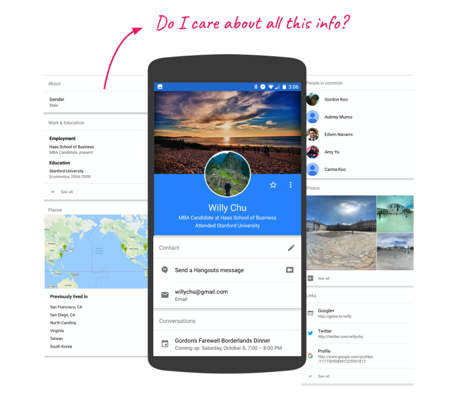
They first want to know who’s this person (Name, title, contact info), followed by the person’s social graph (reporting chain, interaction history), followed by what the person does (responsibilities, skills).

Vision

With these findings in mind, we run a design sprint with 3 other stakeholder teams. In the session, we pinned down the high-level design goals:

  • Unified: Unify fragmented people info across Google apps
  • Relevant: Surface relevant people information in context
  • Seamless: Integrate all people-related services across Google
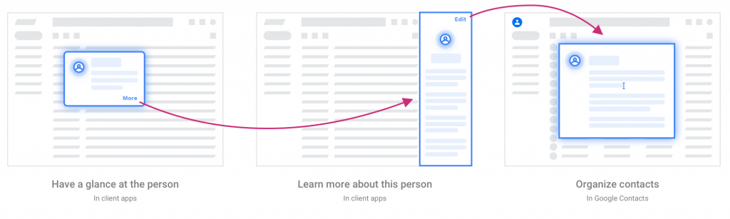
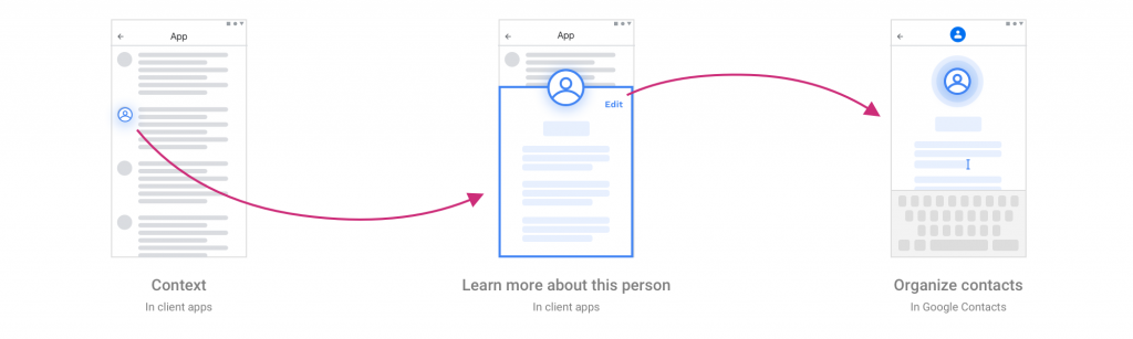
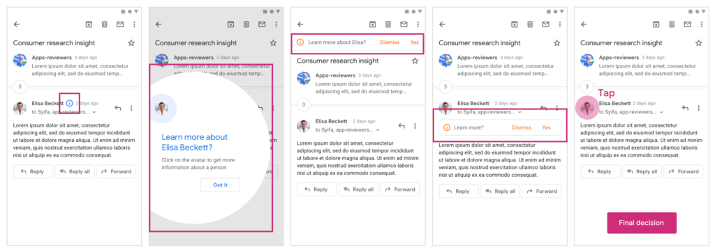
Introducing People Primitives

Based on the early research findings and the vision, we proposed the new People Primitives framework. It is a continuous flow where users can first get an overview of a person in context (e.g. Gmail, Calendar, etc), and then optionally dig more details about this person. By the end of the flow, users can add this person to Google Contacts app and edit personalized information (e.g. nickname). This flow applies to all platforms (Android, iOS, Web), so users will get a consistent experience navigating people-related information in the Google ecosystem.

Flow on web
Flow on mobile

In each step, we prioritized the information Google knows about this person by relevancy. The more useful the information is, the higher the visual hierarchy it has:

1. People Card

On web, users hover over the avatar to have a glance at the person.

2. People Sheet

On mobile, users tap on the avatar to learn more about the person.

3. People Companion

On web, users can get extra information by pulling out the sidebar.

As a bonus feature in Gmail, the sidebar automatically gives users a list of people that match people in the thread.

How we got there

We launched the whole experience in multiple stages. Each stage came with its own challenges and problems to solve. The following are some highlights:

Design a system that adapts to user needs in multiple apps

People Primitives are not standalone products but components integrated with other Google apps, such as Gmail, Calendar, Chat, and Docs/Slides/Sheets, etc. To provide the best value to the product teams, the proposed solution can not just be a UI guideline, but a full-stack framework where the product teams can “plug and go” with some levels of customization. Design-wise, it means that on one hand, I needed to understand and synthesize different use cases from different product teams to form a consistent framework. On the other hand, I had to make sure the framework is flexible enough so that it can fulfill different use cases.

People Card variations for different product teams
Balance between our business goal and product teams’ user needs

As the team working on People Primitives, one of our business goals is to increase the discoverability of the product. However, in Gmail, users have other higher priority tasks to accomplish, such as composing a mail. This is why after exploring different options for People Sheet’s entry point, we decided to go with the simple “tapping avatar to entry” pattern because it has the least distraction in the context of Gmail.

Explorations of of People Sheet’s entry point
Refresh the visual language to deliver a coherent company-wide experience

When we started redesigning the People Primitives in 2017, we refreshed the visual language based on the Material Design framework. In the meantime, we added a lot more information and arrange them with different font sizes, icons, and colors to create an effective visual hierarchy.

Soon after that in 2019, Google introduced another brand-new visual framework called Google Material to strengthen Google’s core values and identity. As a result, we refreshed the visual language again. The new version features its more optimized space and coherent color scheme of the Google brand.

Be inclusive: empathize with users who are different from us

2.4% of people in the US reported having a visual disability in 2016. Since Google apps are used by billions of people in the world, this means millions of our users! When I started working on the project, People Primitives unfortunately was not accessible for the screen reader users. I took the lead to define the accessibility UX guidelines, making sure that we meet the accessibility standard, such as having the right focus state and grouping, enough color contrast, appropriate touch target size, and clear voiceover instruction.

Define the Tab order and grouping for screen readers
Takeaway
The art of being consistent yet flexible

Unlike designing a standalone product where you have full control over the end-to-end experience, designing primitives requires empathizing with each client’s critical user journey. That is to say, we are not meant to be the spotlight, but the facilitator to help users accomplish their primary task. As a result, it’s inevitable that clients may want slightly different content or interactive behavior based on their unique user needs. My goal is to find that balance between consistency and customization.

The challenges of designing at scale

Designing at scale comes with many constraints. For example, each platform (Android, iOS, Web) has different internal launch processes and requirements. Moreover, it took time and effort to understand different stakeholders’ requirements and reach alignment. It was a humbling experience to learn that sometimes things take long for good reasons.