Overview
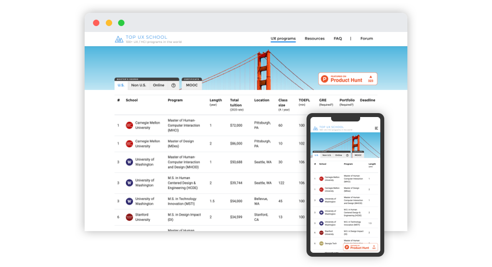
As a UX designer who has gone through some design education, I got many aspiring designers reaching out to me for school recommendations over the years. As I replied to every one of them, I caught myself repeating the information a lot, and sometimes I didn’t have the information they needed. I thought I could be more helpful in the process. As a result, I built Top UX School (www.topuxschool.com) to help people who are new to the UX field to find UX programs that are suitable for them.
Time
11/2018 – 03/2019
Role
Sole designer, researcher, programer
User problem
The process of applying for schools is often times frustrating. When I applied for UX Master’s degree myself back in 2015, the information I could find online tends to be scattered and incomplete. There were some “UX school lists” out there, but it’s not transparent how they came up with the list. Moreover, I had to dig deeply into each school’s website to get basic information like tuition fees and application requirements. It was also unclear to me what are schools’ overall reputation in the industry. All in all, the whole process was time-consuming and inefficient.
Vision
I’d like to create something that I wish existed when I first applied for UX schools. It comes down to the following three aspects:
- Useful: Users should be able to find information they need quickly
- Transparent: Users should be able to understand where the information comes from
- Community-based: If users have more questions, they can reach out for help
User journeys
I interviewed 5 friends who have gone through the process of applying for UX programs. The following are the key journeys based on their experiences and my own experience.
- I want to identify a list of schools that are suitable for me
- I want to know which UX programs are well-recognized in the industry
- I want to know the cost of attendance of each program
- I want to know the application requirements (e.g. GRE/TOFEL score, deadline, portfolio)
- I want to learn from other people’s experiences
The MVP
To address the key user journeys, I came up the first proposal of the website:
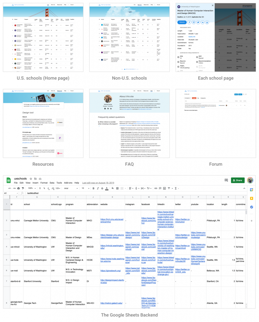
On the homepage, it was a simple list of UX programs in the U.S. ordered by alumni’s career outcomes from LinkedIn. At one glance, users can see all the key information about each school and compare them.
I also included schools from outside of U.S. in the “Non U.S.” tab, as well as Resources and FAQ to give UX beginners a little bit more guidance. Lastly, I created a Forum with the attempt to turn this website into a community in the long term.
To quickly get the MVP out in the world, I spent around six weeks of my spare time building the site with the technology stack I know — Vue.js, Node.js, and Webpack. To make updating easier, I put all the data in Google Sheets and wrote a script to convert it to a JSON file that can be easily displayed on the front end. For the forum, I knew that it would be too much work to write it from scratch and maintain it, so I integrated Discourse with the site, which is an open-sourced forum software with all the basic features I need.
Design iteration
I put the website online by the end of 2018, and later on officially launched the project on Product Hunt in March 2019. I reached out to 5 of my initial interviewees for feedback. Multiple people from the Internet also shared their thoughts with me regarding how the site can be improved. Based on these information, I made some major changes along the way:
Improve the site navigation
Since I launched the site, I’ve heard from at least 3 people requesting schools from outside of the U.S., which I did in the first place. This made me realize that the initial navigation pattern was not very discoverable. Therefore, I moved the entry points down to make them visually more associate with the list on the page.

Improve the ranking methodology
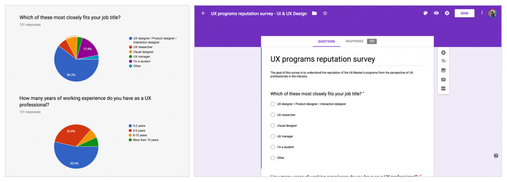
For the MVP, I ranked the school based on the “career outcome” by using LinkedIn to look up schools’ alumni. This approach turned out to be controversial since the LinkedIn data tends to be incomplete and not necessarily reliable (I only have access to people within my 3rd-degree network). Plus, it’s not meaningful to define success solely based on the alumni’s current employer. Most of the criticism I received initially centered around this issue. As a result, I decided to pivot to another approach — conduct a survey to understand the program’s industry reputation by literally asking the industry professionals “What universities would you recommend to someone who wants to pursue a UX master’s degree?” I posted this survey in five UX Facebook groups in the end of March in 2019 for two weeks to collect the data. These groups all target global UX industry professionals. I received 131 responses, in which 101 of them are valid (Invalid responses typically are answers irrelevant to the question).
In the modified version, the schools on the site are ordered based on the result of this survey. Schools that rank on top are schools with more recommendations. Schools with the same ranking mean that they have an equal amount of recommendations. Schools added after this survey was done will be included at the end of the list.
Add the “sorting” feature
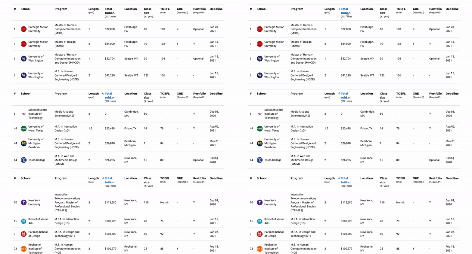
Some users have very specific needs in mind, such as their budget and the time they want to finish the degree. To improve their search experience, I added the sorting feature on the header of the table, allowing users to quickly get a customized list based on the criteria they care about.
Enrich the content
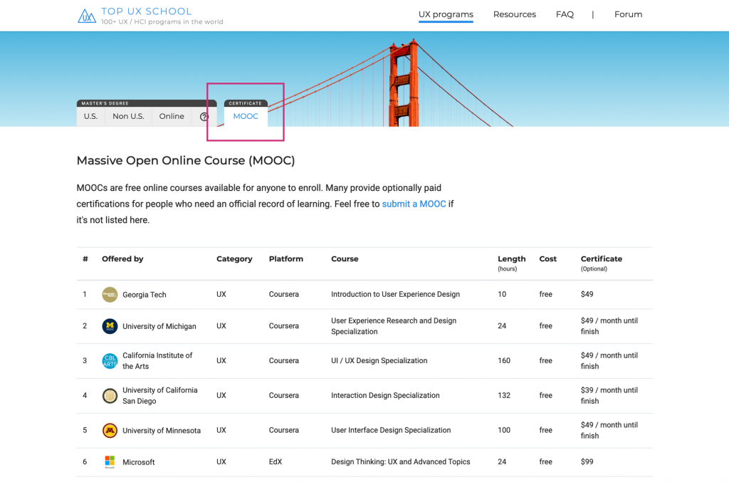
Initially, I started with the site with a list of UX Master’s degrees. I quickly realized that people who come to the site might be looking for alternatives of UX education beyond a Master’s degree. Among those, the Massive Open Online Course (MOOC) generates the most interest. Therefore, I included a MOOC list.
As more and more people participated in the forum, I also re-grouped posts into different categories to make a better browsing experience.

Outcome
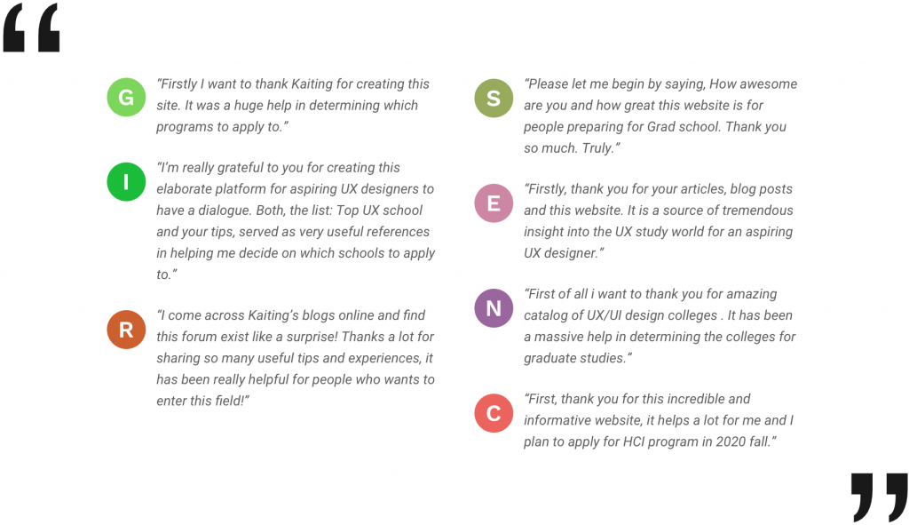
By the time of this writing, the website received on average 6k / monthly active users, where 87% of them come from organic search. Many users have reached out to me showing their appreciation.
Takeaway
Build a meaningful product
Prior to Top UX School, I had a long list of side projects. Most of them never made their way out of my hard drive, because I didn’t feel like continuing after the initial honeymoon phase ended. Top UX School is a little bit different in the sense that I built it to solve my own problem. I designed it thinking about the tool I wish had existed when I personally went through the school selecting process. I believe this is one of the key elements in terms of building a sustainable product.
The importance of user feedback
Being the only designer and developer is a double-edged sword. On one hand, I had the full autonomy to decide the project vision and direction. On the other hand, I have no one to bounce off ideas or validate my assumptions before I test the product in the real world. This makes collecting user feedback extremely critical in the process. I’m very thankful that many people on the Internet were generous enough to share their thoughts with me.