Question background
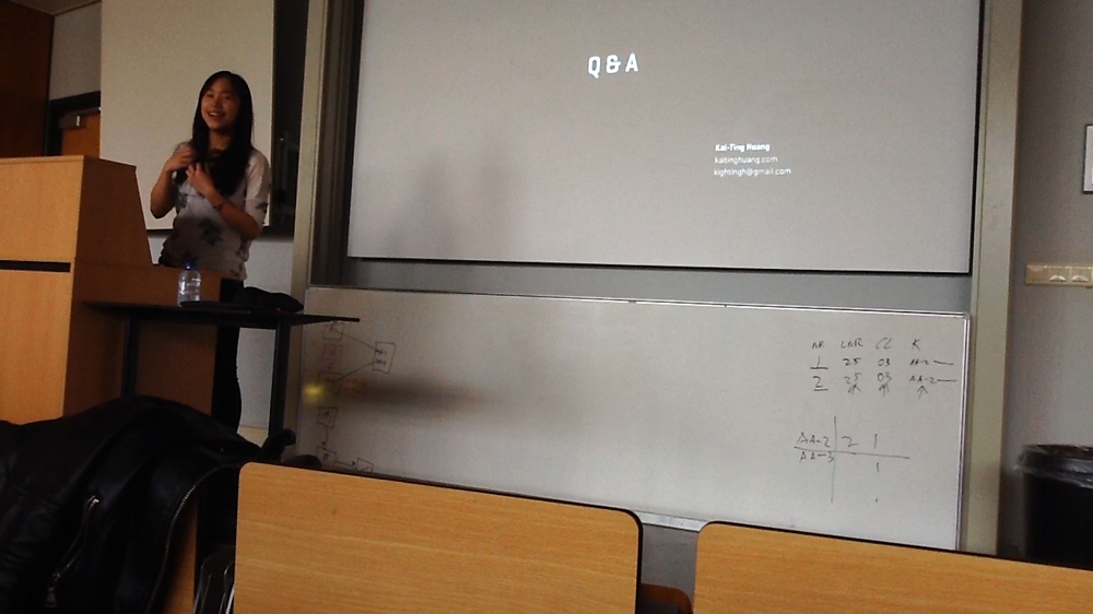
I was asked this question by a sophomore student majoring in Communication & Multimedia Design when I gave a speech about the design process at de Haagse Hogeschool. Basically, he has a feeling that the UI guidelines (e.g. iOS Human Interface Guidelines / Android Design Guidelines) sort of limit what designers can do on the screen and it does harm to creativity.
My answer
“I agree to follow the guidelines to some extent because they exist for a reason.”
My reasons
Firstly, the UI guidelines, no matter it’s iOS or Android, were made by UX specialists in Apple or Google who spent significant amount of time and effort conducting UX research and usability tests to come up with logical solutions to navigate on a small piece of glass. Those solutions are not just for some specific use cases, but can be widely used in almost all the scenarios, taking many steps further into consideration. That is to say, it’s extendable and flexible. Therefore, unless you can put forth something proven to be better than those guidelines, why not adopt rules that already work?
Second, since 2007 when iPhone started to change how people interact with their phones, most of the apps in the market were designed based on the UI guidelines. In other words, most of users already got used to the interaction and flow in a certain way, such as the side menu, the back button on the top left corner, the edit button on the top right corner, etc. Of course designers can come up with something that’s “creative”, totally breaking the conventions. However, chances are that users would have more difficulty understand the new logic and thus it’s not as usable and intuitive.
For example, if you are given an assignment to design a traffic light. Instead of making the lights in red, yellow and green, you decide to do it with blue, purple and pink because it’s creative and extraordinary. In practice, it’s indeed one-of-a-kind, but it will probably cause way more car accidents than the conventional design and therefore the new design fails to deliver the original function.
Finally, different from art, one of the essences of design is that it always has restrictions, which I consider challenging and exciting. I think that designers don’t necessarily have to be “less creative” when they follow some rules. In contrast, they have to be “more creative” to come up with something that aligns with the logic of most of users and at the meantime lightens up users’ face with it’s own identity. It’s always difficult but so beautiful once it’s done properly!
