
Design thinking is a never-ending process. In theory, every tiny component in a product has room for improvement. We can run testings, again and again, to keep optimizing it. The work will never be “finished”. However, in reality, even the largest tech company has limited resources (time and money) on each project. It’s critical to be intentional about where to put the resources? When to shift gear from one effort to another? Most importantly, what’s the definition of “success” for a product/feature?
To answer these questions, setting metrics is the key.
Metrics in simple terms is the quantifiable goals for your project. It can be measured by both the quantitative data in logs and the qualitative result from the user research. For instance, you can say you want a 20% increase of monthly active users (MAU) after the feature launch. You then set up an analytical dashboard and compare MAU pre and post-launch. Or you can say you want 80% users to feel satisfied with the refined flow. You can send out surveys to users to see if their reaction meets the expectation.
It’s worth noting that there’s no absolute “right” metrics for every product/feature. “What is right” will always depend on the business goal and the product vision. For example, in the enterprise context, “engagement” is not a super relevant metric because most users don’t have a choice about what product to use. Instead, “user satisfaction” and “task completion rate” are more useful because they speak directly to the effectiveness of users’ day to day work.
To get a head start, existing frameworks are helpful in terms of broadening the thinking. In the following, I put together 10 frameworks about metric settings that I’ve seen being used or discussed in the industry. I’ll start with the popular business-oriented metrics, moving on to experience-oriented ones, and end with the lesser-known-yet-important social impact metrics. Hopefully, these can serve as inspirations for product teams to draft a meaningful story of success.
Business-oriented metrics
1. AARRR framework (aka Startup Pirate Metrics)
Proposed in 2007 by Dave McClure (presentation, slides), AARRR is a framework focussing on the company growth and therefore it became widely accepted in the startup world.
The gist of the framework is to monitor how you lose your customers along the whole customer lifecycle. In other words, you don’t just track # of site visitors, but also other things deeper down the conversion funnel, including the following five steps:
- Acquisition: where / what channels do users come from? (e.g. # of app downloads, click-through rate from pay-per-click ads)
- Activation: what % of users have a “happy” initial experience? (e.g. Sign-up rate, subscription rate)
- Retention: do they come back over time? (e.g. Monthly active users)
- Referral: do they like it enough to tell their friends? (e.g. # of new sign up through referral)
- Revenue: can you monetize any of this behavior? (e.g. Conversation rate)
After setting the metrics for each step, you then start tweaking the design and communication to meet the goals. If you see a significant drop-off in any step, say, 80% of site visitors sign up but only 10% of them come back within 30 days, then you know your product has poor retention. Perhaps your home page communication doesn’t attract the right users? Or the onboarding experience isn’t sufficient? Ask your users why and make your best guess about the solutions, A/B test a lot, rinse and repeat.
More: https://medium.com/@ginoarendsz/an-introduction-to-the-aarrr-framework-b8570d6ae0d2
2. RARRA framework
Proposed by Gabor Papp in 2017, RARRA is almost identical to AARRR except it re-prioritized “Retention” over “Acquisition”:
- Retention: do they come back over time?
- Activation: what % have a “happy” initial experience?
- Referral: do they like it enough to tell their friends?
- Revenue: can you monetize any of this behavior?
- Acquisition: where / what channels do users come from?
The rationale is that the market for web apps and mobile apps has become so saturated and competitive these days. Consequently, if an app is not good enough to make a good first impression, users will likely never come back. In other words, before spending tons of money on online marketing, the product team should first focus on providing great value to users to fuel organic growth.
More: https://mobilegrowthstack.com/why-focusing-on-acquistion-will-kill-your-mobile-startup-e8b5fbd81724
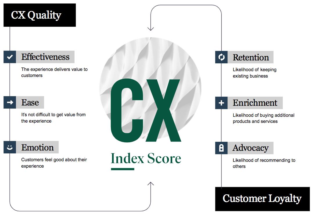
3. Customer Experience Index (CX Index)
Unlike User Experience (UX) that focuses on the interaction between users and a particular product, Customer Experience (CX) looks into all touch points of a brand (both physical and digital) to measure customer loyalty and how it affects the company’s revenue.
Proposed in 2016, Forrester’s CX Index score has become one of the leading CX benchmarks in the business consulting world. The index includes the six aspects (see the graph below) and two key indicators: customer satisfaction (CSAT) and the net promoter score (NPS). The higher your CX index score, the more you can win and retain customers. (Example dashboard)
Experience-oriented metrics
Business-oriented metrics are extremely important, but they don’t necessarily work well on measuring UX because it’s too high level. For example, a rise in the conversation rate could be caused by a design change or a promotion. It can also simply be genuine popularity of the feature. To measure the design more accurately, there’s a demand for more granular metrics that directly relate to the quality of the experience.
4. Google’s HEART framework
Proposed in 2010 by the Google research team and applied widely in the company, the HEART framework aims at measuring user experience on a large scale with the following five categories:
- Happiness: How people feel about your product? (E.g. Use the survey to track Satisfaction and Ease of use)
- Engagement: How people are using your product? (E.g. # of 7-day active users, # users starts a new search per day)
- Adoption: New users (E.g. # of accounts created in the last 7 days)
- Retention: Existing users (E.g. % of users who use the feature again)
- Task Success: Complete actions (E.g. # of users who can accomplish a task)
These metrics can be applied both at the product level and down to the feature level. For example, to measure the retention, one can look at # of monthly active users for the product, or see if users do the same task (e.g. create an event in Calendar) again within 30 days. The latter approach allows you to evaluate a particular flow more precisely.
More: https://library.gv.com/how-to-choose-the-right-ux-metrics-for-your-product-5f46359ab5be
5. System Usability Scale (SUS)
Developed by John Brooke in 1986, System Usability Scale provides a “quick and dirty” way to assess the usability of a system. It includes 10 items in a questionnaire and users respond with a Likert scale (Strongly disagree to strongly agree) for each question:
- I think that I would like to use this system frequently.
- I found the system unnecessarily complex.
- I thought the system was easy to use.
- I think that I would need the support of a technical person to be able to use this system.
- I found the various functions in this system were well integrated.
- I thought there was too much inconsistency in this system.
- I would imagine that most people would learn to use this system very quickly.
- I found the system very cumbersome to use.
- I felt very confident using the system.
- I needed to learn a lot of things before I could get going with this system.
This will produce a usability score for the product/feature, which product teams can use to compare between the old and new experiences or between the competitor’s and your own designs.
More: https://measuringu.com/sus/
Social impact metrics
Most metrics mentioned until this point are generally easy to understand and measure. However, “easy” doesn’t necessarily mean that it’s “right” or “important”.
The truth is that products tend to grow in the direction we measure. That’s why these days tech companies pay more attention to metrics beyond business interest to win back trust from users. For instance, last year Facebook changed its News Feed metrics from finding relevant information to having meaningful social interactions. Similarly, Youtube announced new tools to help users “focus on what matters most and disconnect when needed”.
It’s definitely not easy to come up with actionable social impact metrics. The impact can occur “out of sight” or it can take really long to measure (e.g. habit forming, education outcome). Nevertheless, it doesn’t hurt to be more intentional about the long-term vision. The following are five newly emerged frameworks to spur the discussion.
6. Below the Iceberg
Proposed by design strategists Will Anderson and Karwai Ng in 2017, Below the Iceberg framework encourages designers to think at a system level — from individuals to society to “STEEP” (societal, technological, environmental, economic and political).
More: https://medium.com/@willwai/the-iceberg-canvas-9f90d50de656
7. The Tarot Cards of Tech
In 2018, Artefact, a Seattle-based design firm, released the Tarot Cards of Tech to encourage creators to think about the outcomes of technology and opportunities for positive change. Each card contains one provocative question to facilitate the brainstorming. For example,
- “What’s the worst headline about your product you can imagine?”
- “What would using your product too much look like?”
- “Who or what disappears if your product is successful?”
More: https://www.artefactgroup.com/case-studies/the-tarot-cards-of-tech/
8. Value Sensitive Design (VSD)
Developed by professor Batya Friedman at the University of Washington in late 1980s, Value Sensitive Design (VSD) is a theoretically grounded approach to the design of technology that accounts for human values in a principled and comprehensive manner. Similar to User-centered Design (UCD), Value Sensitive Design (VSD) covers the whole spectrum of the design process including problem definition, research, prototyping, and testing. The key difference is that UCD focuses on the “users” of the product whereas VSD goes beyond users to consider “stakeholders” — anyone who’s affected by the product.
More: https://vsdesign.org/
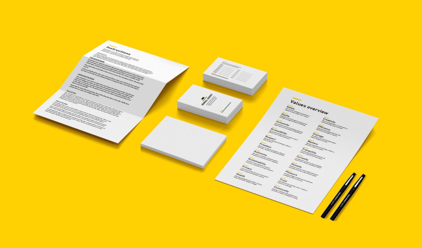
9. Ethics for Designers toolkit
Ethics for Designers toolkit is a graduation project by Jet Gispen at Delft University of Technology in 2017. The toolkit provides guidelines for designers to incorporate ethics into their design process.
More: https://www.ethicsfordesigners.com/
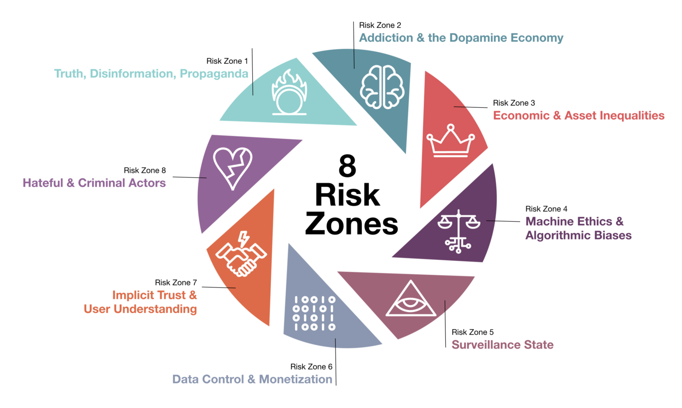
10. Ethical OS toolkit
Introduced by Omidyar Network in collaboration with Institute for the Future (IFTF) in 2018, the Ethical OS toolkit helps developers and designers anticipate the future impact of technologies they’re working on today, covering the following 8 aspects:
More: https://ethicalos.org/